NYS Counties Cartogram Part 1
Last year the New York Times published this image to represent election results for a New York State race (from here):
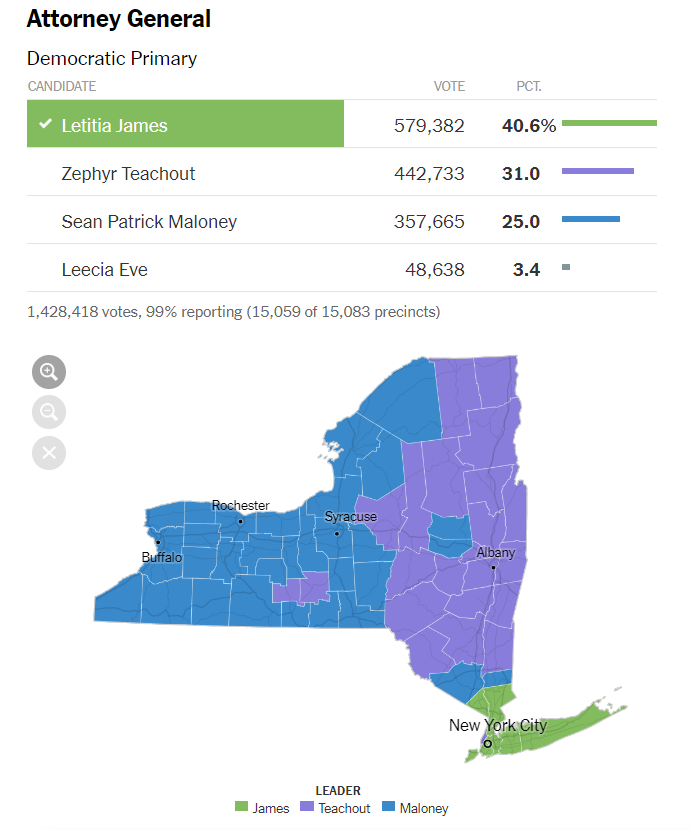
I don’t think this map effectively communicates the results of the election. The visual marks are areas that accurately represent the geographic shape of NYS counties and have color corresponding to the candidate that got the most votes in the county. This means the total color area for a candidate is the total county area of counties that the candidate won. So on first impression, it seems as if this election was a close race between Teachout and Maloney with James a distant third, when in fact James won. The number or total area of counties won is not so meaningful in a statewide popular vote election such as this, because (perhaps among other things)
- county area is not necessarily proportional to county population and
- votes for a candidate in a county the candidate lost still count for the candidate in the statewide popular vote, so it’s informative to know who came in second (and third) and by how much.
The population issue is particularly a problem for representations of New York State where some of the smallest counties by area are some of the largest by population (for example the New York City counties like Queens and Kings) and vice versa (e.g. Hamilton). From the NYT map one sees that James was the highest vote getter in the populous downstate counties (all except Manhattan which Teachout won, though you can barely see this on the map).
This got me thinking about representations of things like NYS counties that better communicate population, and beyond that better election maps. We can represent the counties and total vote counts with a bar chart:
And then add in vote counts for each candidate as stacked bars:
This chart better shows the popular vote count for each candidate by county and the general result for the state overall, but loses all the geographic meaning that the map had. For example, we can’t tell from the bar chart as the NYT map seems to show that Maloney won many votes in the western counties, Teachout in the east and James in the south. Also, most of the high population counties (bars at the top of the chart) are in the lower part of the state, a fact not communicated by the bar chart. Can we visualize this election in way that both accurately represents the popular vote counts both statewide and countywide and communicates the general location of counties and their closeness to each other?
In the next part I’ll talk about the concept of a cartogram, which is one way to visualize the relationships between geographic entities along with non-geographic properties of those entities (e.g. number of votes for a candidate in an election).