NYS Counties Cartogram Part 2
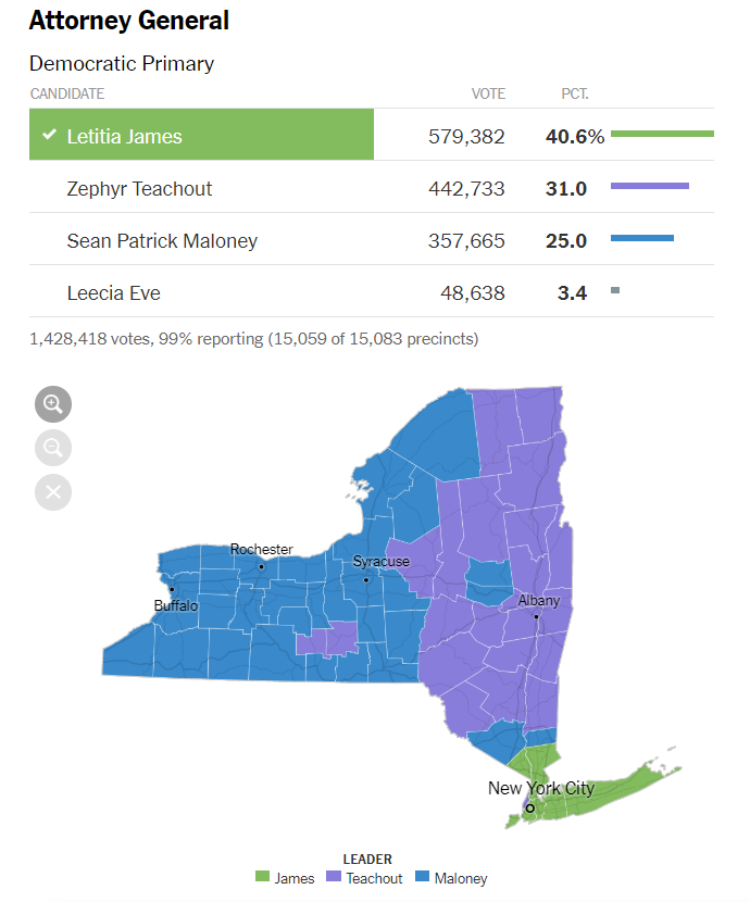
In part 1, I talked about why I felt the following map doesn’t accurately convey the results of the election:
and showed this bar chart as an alternative that better shows the popular vote result but loses geographic relationships amongst the counties:
Cartograms
Researching other ways to represent geographic objects brought me to the concept of a cartogram. A cartogram is a visual representation of geographic objects in which the areas of objects are distorted to represent some statistic. I’ve found this survey paper1 by Nusrat and Koburov to be a helpful introduction to the history of cartograms and some of the many algorithms for generating them. The paper also describes different information that the various techniques aim to preserve, like the shapes of the geometric objects, or their adjacencies.
The most common way that people build cartograms in d3 seems to be the topogram implementation of the Dougenik, Chrisman, and Niemeyer2 algorithm for a continuous cartogram. Here is an example of the implementation in use. I don’t use this type of cartogram below because I’m not looking to preserve shapes of counties and adjacencies, and I want to use the mark for each county to further show the vote counts for the four candidates as I describe below.
An attempt at an election cartogram
Note that my following description and implementation of a type of cartogram was made before I discovered through the Nusrat and Koburov paper that I was essentially making a Demers cartogram3. Also before I found examples of Demers-like cartogram implementations using d3 force simulations, see this and this.
For a cartogram of the election, the shape of a county didn’t need preserving but rather its position in the state and relative to other counties. So perhaps we could first represent each county by a square, and then fill each square with representations of candidate vote totals in the county. All squares could be equal in size, so that no county occupies more space on the canvas than any other. But where do we place the county squares? The locations of the squares overall and relative to the other squares are how we will communicate the geographical structures in the data so we want to place them in geographically accurate positions.
One way we could place the squares is to center them on the centroids of the county shapes. The next sketch shows the counties, their centroids and squares centered at the centroids and lets you change the size of the squares. This seems like a reasonable way to place square, except that depending on the size of the square they overlap. Overlap is a problem for us because it can make it difficult to see differences between properties of the overlapping counties. For the smallest square size of 5, there is no overlap but the squares are also prohibitively small to place other marks in. For larger square sizes like 20, there is overlap in various parts of the state, especially NYC.
Removing overlap
How to remove overlap? The method I show here iterates through the marks, calculates overlaps and moves each mark away from overlapping marks and repeats until there is no more overlap left. For the sake of aesthetics, this movement is implemented as a repulsive force that overlapping marks apply on each other, plus friction to stop marks from moving too much once they no longer overlap. The algorithm handles rectangular marks of different sizes for a use case where the size or shape of marks represent some property.
I also add an attractive force to bring outlier marks closer in to reduce space between marks which in my idea for the election map would not be directly used and which might make comparison between counties a little more difficult. For each mark the three closest neighboring marks are identified (by distance between the edges of the marks) and pull the mark closer to them, as long as the mark is not already adjacent to one of them (because we don’t want to introduce more overlaps!).
Sketch: rearranging random rectangles
The below sketch shows the algorithm at work. Starting with a random arrangement of 10 rectangles of different sizes, the sketch shows how the positions of rectangles change after applying successive rounds of repulsive/attractive forces. The dark orange rectangles show the updating positions, while the light orange filled in rectangles show the original positions of the rectangles for comparison. The updating stops once the total velocity of all marks is below a low threshold, or the algorithm has run through a large number of iterations. With a small number of rectangles (in this case 10) that are allowed to move arbitrarily far apart from each other (including out of view), the algorithm usually finishes quickly (in this case usually within 100 iterations).
We see in the sketch that the algorithm tends to keep the rectangles in the same relative places as the original positions while spreading them out enough to remove overlaps. Single outliers might move far to be closer to neighbors but generally keep the same relative direction to the other rectangles. Multiple non-overlapping outliers that touch each other will not move however.
In the next and last part we will apply this algorithm to New York State county squares and attempt to build a visualization of the election that gives a good idea of candidate’s relative popular votes while retaining some of the geographic information of the NYT map.
Notes
- votes are from here
- in addition to the Nusrat and Koburov paper, I found Dorling’s survey paper4 a great read, and want to learn more about the Dorling cellular automata technique for making a cartogram
- as I learn more about d3 force layouts, I think they’re appropriate for building Demers-like cartograms. To that end, d3-bboxCollide might be helful
References
-
Nusrat and Koburov, The State of the art in Cartograms, arxiv ↩
-
Dougenik, Chrisman, and Niemeyer, An algorithm to construct continuous area cartograms, The Professional Geographer 37, 1 (1985), 75–81 ↩
-
Bortins, Demers, and Clarke, Cartogram types, http://www.ncgia.ucsb.edu/projects/Cartogram_Central/types.html ↩
-
Dorling, Area Cartograms: Their Use and Creation, http://www.dannydorling.org/wp-content/files/dannydorling_publication_id1448.pdf ↩